XAML in Xamarin.Forms 基礎篇 電子書

XAML in Xamarin.Forms 基礎篇 電子書

Xamarin.Forms 快速入門 電子書

Xamarin.Forms 快速入門 電子書

2015/10/01

使用Material Theme來變更App主題與風格 Theme / Style

在Android 5.0之後,提出了 Material Theme的設計指引,提供了每個開發者有個統一規範可以遵循來設計每個App,透過這個指引,我們可以透過 Theme / Style 的XML定義檔案,不需要修正任何C#程式碼,就可以直接將您的App風格樣貌做個更換。

了解更多關於 [Xamarin.Android] 的使用方式
了解更多關於 [Xamarin.iOS] 的使用方式
了解更多關於 [Xamarin.Forms] 的使用方式
了解更多關於 [Hello, Android:快速入門] 的使用方式
了解更多關於 [Hello, iOS – 快速入門] 的使用方式
了解更多關於 [Xamarin.Forms 快速入門] 的使用方式

不過,Material Theme這樣的設計方式,只存在於 Android 5.0 (API 21)或者更新版本的作業系統環境上才能夠運行,若您想要使用這樣的方式來設計您的App,並且希望讓您的App可以在比Android 5.0更舊的版本上來運行,並且享受到同樣的好處,您需要透過 v7 Support Libraries的支援,它提供了 material 設計樣式的主題 theme,可以用來配置不同的UI控制項,並且可以讓您客製化不同的顏色配置。
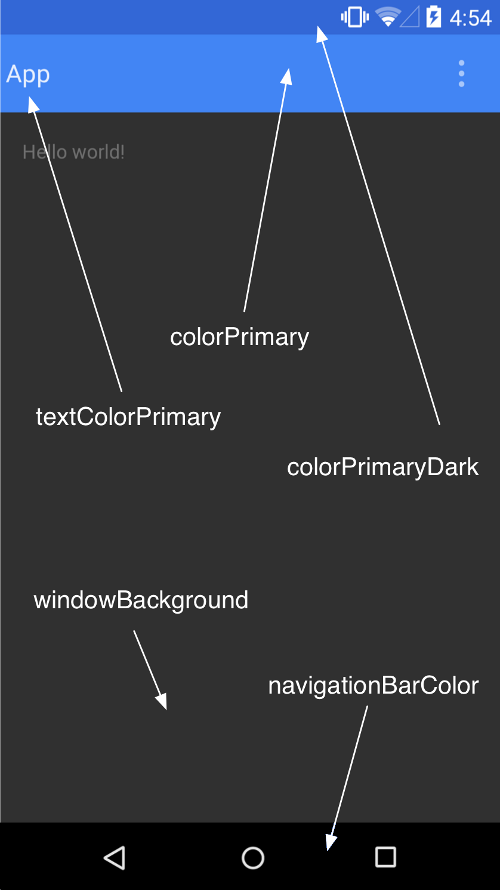
在看到如何使用之前,我們先看看有哪些項目是我們可以透過 Theme / Style的方式來進行替換不同的風格,在下圖中,我們可以看到不同的屬性,例如:colorPrimary, colorPrimaryDark等等,透過定義這些屬性到不同的顏色色碼,我們就可以立即將您的App更換到不同的風格樣貌。

首先,我們需要在 Resources/values目錄內styles.xml,加入一些定義,如下所示。
在 styles.xml檔案內定義我們App要用的基礎主題 MyTheme.Base,這個主題內容是從 Theme.AppCompat.Light.DarkActionBar繼承而來;  Theme.AppCompat.Light.DarkActionBar 這個主題,是在 Meterial Theme內預設定義的。  我們在自行定義的基礎主題 MyTheme.Base 中,修改了許多顏色配置,這些顏色配置將會存在於 Resources/values/colors.xml內,  也就是說,我們要變更App的顏色風格配置,只需要修改Resources/values/colors.xml內的顏色色碼即可。
想要參考更詳盡的 系統提供的 Theme / Style ,可以參考 Android API開發指南的Styles / Themes部分內容
R.Style的參考文件中,其實並不是一個很好與方便查詢各 Style和屬性的地方,因為在其官方文件上,這部分並沒有寫得相當清楚;如果您想要更進一步、完整的了解與參考這些Android內的 Style 和 Theme,可以參考底下兩個連結,在這兩個連結中,完整的列出了系統內提供的各個 Style & Theme 與其屬性定義名稱,透過這樣的查詢,您可以廓中您的App成為更多采多姿的程式。
Android Styles (styles.xml)
Android Themes (themes.xml)
在上圖中所所標示出來的 colorPrimary, colorPrimaryDark, textColorPrimary, windowbackground, navigationbarcolor 這些屬性,就可以透過地下的方式來進行擴充,若想要自訂其他的項目,可以參考與查詢上述兩個 Android Style / Android Themes 這兩份文件來做到。
  <style name="MyTheme" parent="MyTheme.Base">
  </style>

  <!--
  定義我們App要用的基礎主題 MyTheme.Base,這個主題內容是從 Theme.AppCompat.Light.DarkActionBar繼承而來
  Theme.AppCompat.Light.DarkActionBar 這個主題,是在 Meterial Theme內預設定義的
  我們在自行定義的基礎主題 MyTheme.Base 中,修改了許多顏色配置,這些顏色配置將會存在於 Resources/values/colors.xml內
  也就是說,我們要變更App的顏色風格配置,只需要修改Resources/values/colors.xml內的顏色色碼即可
  -->
  <!-- Base theme applied no matter what API -->
  <style name="MyTheme.Base" parent="Theme.AppCompat.Light.DarkActionBar">
    <item name="windowNoTitle">true</item>
    <!--We will be using the toolbar so no need to show ActionBar-->
    <item name="windowActionBar">false</item>
    <!-- Set theme colors from http://www.google.com/design/spec/style/color.html#color-color-palette-->
    <!-- colorPrimary is used for the default action bar background -->
    <item name="colorPrimary">@color/primary</item>
    <!-- colorPrimaryDark is used for the status bar -->
    <item name="colorPrimaryDark">@color/primaryDark</item>
    <!-- colorAccent is used as the default value for colorControlActivated which is used to tint widgets -->
    <item name="colorAccent">@color/accent</item>    
    <!-- You can also set colorControlNormal, colorControlActivated colorControlHighlight and colorSwitchThumbNormal. -->
    <!-- Option to hide the drop shadow here    
      <item name="actionBarStyle">@style/MyTheme.ActionBar</item>
      <item name="android:windowContentOverlay">@null</item>
    -->
  </style>

  <style name="MyTheme.ActionBar" parent="style/Widget.AppCompat.Light.ActionBar.Solid">
    <!-- remove shadow below action bar -->
    <!-- <item name="android:elevation">0dp</item> -->
    <!-- Support library compatibility -->
    <item name="elevation">0dp</item>
  </style>
</resources>

底下為自行定義擴充的顏色定義,上面的Xml定義中,標示著黃底紫色的文字的屬性,其顏色代碼,就是參考底下這個XML定義。
<?xml version="1.0" encoding="utf-8"?>
<!--專案範本預設的樣式-->
<!--Get colors from: http://www.materialpalette.com/-->
<!--<resources>
  <color name="primary">#03A9F4</color>
  <color name="primaryDark">#0288D1</color>
  <color name="accent">#FFC107</color>
  <color name="lightPrimary">#B3E5FC</color>
  <color name="textIcon">#FFFFFF</color>
  <color name="primaryText">#212121</color>
  <color name="secondaryText">#727272</color>
  <color name="divider">#B6B6B6</color>
  <color name="activated_color">#E8E8E8</color>
</resources>-->

<!--自訂顏色-->
<resources>
  <!--Get colors from: http://www.materialpalette.com/-->
  <color name="primary">#4CAF50</color>
  <color name="primaryDark">#388E3C</color>
  <color name="accent">#FFEB3B</color>
  <color name="lightPrimary">#C8E6C9</color>
  <color name="textIcon">#FFFFFF</color>
  <color name="primaryText">#212121</color>
  <color name="secondaryText">#727272</color>
  <color name="divider">#B6B6B6</color>
  <color name="activated_color">#E8E8E8</color>
</resources>

上面的 Colors.xml 檔案,我們定義了兩種情境顏色配置,下面螢幕截圖則是執行結果;下圖左邊是 [專案範本預設的樣式]定義,下圖右邊則是[自訂顏色]的執行結果

image image

image image

當然,我們也有方便的視覺快速設定方式,您可以透過 material palette 網頁,得到底下的設定

image


image

Xamarin.Android Templates Pack 範本解密3

在上一篇 [Xamarin.Android Templates Pack 範本解密2]文章中,我們剖析了專案內的 Activity & 相關的 Layout 配置,不過,在 Resources\layout 目錄下,還有兩個檔案沒有說明到
fragment1.axml
<?xml version="1.0" encoding="utf-8"?>
<LinearLayout xmlns:android="http://schemas.android.com/apk/res/android"
    android:orientation="vertical"
    android:layout_width="fill_parent"
    android:layout_height="fill_parent">
    <TextView
        android:text="@string/fragment1"
        android:textAppearance="?android:attr/textAppearanceLarge"
        android:layout_width="match_parent"
        android:layout_height="match_parent"
        android:id="@+id/textView1"
        android:gravity="center" />
</LinearLayout>

Fragment1.cs 這個檔案定義這個 Fragment 的控制相關的行為,程式碼內容如下,我們可以看到,這個類別內並沒有複雜的定義,而是在 OnCreateView 方法內,使用 LayoutInflater.Inflate方法,指定這個 Fragment要顯示的視覺配置內容。

    public class Fragment1 : Fragment
    {
        public override void OnCreate(Bundle savedInstanceState)
        {
            base.OnCreate(savedInstanceState);

            // Create your fragment here        }

        public static Fragment1 NewInstance()
        {
            var frag1 = new Fragment1 { Arguments = new Bundle() };
            return frag1;
        }


        public override View OnCreateView(LayoutInflater inflater, ViewGroup container, Bundle savedInstanceState)
        {
            var ignored = base.OnCreateView(inflater, container, savedInstanceState);
            return inflater.Inflate(Resource.Layout.fragment1, null);
        }
    }


fragment2.axml
<?xml version="1.0" encoding="utf-8"?>
<LinearLayout xmlns:android="http://schemas.android.com/apk/res/android"
    android:orientation="vertical"
    android:layout_width="fill_parent"
    android:layout_height="fill_parent">
    <TextView
        android:text="@string/fragment2"
        android:textAppearance="?android:attr/textAppearanceLarge"
        android:layout_width="match_parent"
        android:layout_height="match_parent"
        android:id="@+id/textView1"
        android:gravity="center" />
</LinearLayout>

Fragment2.cs 這個檔案定義這個 Fragment 的控制相關的行為,程式碼內容如下,我們可以看到,這個類別內並沒有複雜的定義,而是在 OnCreateView 方法內,使用 LayoutInflater.Inflate方法,指定這個 Fragment要顯示的視覺配置內容。

    public class Fragment2 : Fragment
    {
        public override void OnCreate(Bundle savedInstanceState)
        {
            base.OnCreate(savedInstanceState);

            // Create your fragment here        }

        public static Fragment2 NewInstance()
        {
            var frag2 = new Fragment2 { Arguments = new Bundle() };
            return frag2;
        }


        public override View OnCreateView(LayoutInflater inflater, ViewGroup container, Bundle savedInstanceState)
        {
            var ignored = base.OnCreateView(inflater, container, savedInstanceState);
            return inflater.Inflate(Resource.Layout.fragment2, null);
        }
    }


這兩個 .axml檔案,定義了兩個 Fragment,而當我們在 MainActivity內,有定義了當點選了導覽列中的功能表選項的話,會進行切換到不同的 Fragment

            //定義事件,當 navigation view 內的功能表選單有被選取的時候,要做何相對應的處置            navigationView.NavigationItemSelected += (sender, e) =>
            {
                e.MenuItem.SetChecked(true);

                switch (e.MenuItem.ItemId)
                {
                    case Resource.Id.nav_home_1:
                        ListItemClicked(0);
                        break;
                    case Resource.Id.nav_home_2:
                        ListItemClicked(1);
                        break;
                }

                // 這是 Google 新推出的 Metrial Design
                // 詳細說明,請參考 https://www.google.com/design/spec/material-design/introduction.html
                // 底下為產生類似 Toast 的簡短提示訊息通知效果
                Snackbar.Make(drawerLayout, "You selected: " + e.MenuItem.TitleFormatted, Snackbar.LengthLong)
                    .Show();

                // 使用動畫撥放方式,關閉所有正在開啟的 Drawer views
                drawerLayout.CloseDrawers();
            };


而 ListItemClicked方法定義如下,我們可以看到,這個方法會根據所選擇的項目,產生相對應的Fragment物件,並且透過 SuppotFragmentManager的 BeginTranscation 來進行切換到所指定的 Fragment。

Fragement是我當初學習 Android UI時候,一開始不太了解的東東,不過,把 Fragment當作是在 WPF中的 User Control,這樣的使用者控制項,是可以反覆使用的,也就是說,一旦我們定義好了之後,這些 Fragment是可以用於不同的 Activity內。
        private void ListItemClicked(int position)
        {
            //this way we don't load twice, but you might want to modify this a bit.
            if (position == oldPosition)
                return;

            oldPosition = position;

            Android.Support.V4.App.Fragment fragment = null;
            switch (position)
            {
                case 0:
                    fragment = Fragment1.NewInstance();
                    break;
                case 1:
                    fragment = Fragment2.NewInstance();
                    break;
            }

            SupportFragmentManager.BeginTransaction()
                .Replace(Resource.Id.content_frame, fragment)
                .Commit();
        }


最後,我們要來看 Resources\values 內的一些常數定義內容,首先看到的是 colors.xml 檔案,這個檔案定義了 Activity 的要顯示的顏色配色定義。

這些配色定義,將會在樣式定義檔案 styles.xml 內使用到
<?xml version="1.0" encoding="utf-8"?>
<resources>
  <!--Get colors from: http://www.materialpalette.com/-->
  <color name="primary">#03A9F4</color>
  <color name="primaryDark">#0288D1</color>
  <color name="accent">#FFC107</color>
  <color name="lightPrimary">#B3E5FC</color>
  <color name="textIcon">#FFFFFF</color>
  <color name="primaryText">#212121</color>
  <color name="secondaryText">#727272</color>
  <color name="divider">#B6B6B6</color>
  <color name="activated_color">#E8E8E8</color>
</resources>

接下來看看格式定義檔案的內容 styles.xml,在這個檔案內,我們定義一個 MyTheme樣式,他繼承了 MyTheme.Base;而 MyTheme.Base則是繼承從 Theme.AppCompat.Light.DarkActionBar,並且做了些修正來取代系統中的定義,另外還有兩種 Theme可以來選擇,分別是 Theme.AppCompat / Theme.AppCompat.Light

例如:我們定義了Theme.AppCompat.Light.DarkActionBar內用到的 colorPrimary 顏色,將會使用 Resources\values\color.xml 內的 primary 來取代,也就是這個色碼 #03A9F4

而有些資源資料,可以從這裡取得 http://developer.android.com/intl/zh-tw/design/downloads/index.html#action-bar-icon-pack
<?xml version="1.0" encoding="utf-8" ?>
<resources>
  <style name="MyTheme" parent="MyTheme.Base">
  </style>
  <!-- Base theme applied no matter what API -->
  <style name="MyTheme.Base" parent="Theme.AppCompat.Light.DarkActionBar">
    <item name="windowNoTitle">true</item>
    <!--We will be using the toolbar so no need to show ActionBar-->
    <item name="windowActionBar">false</item>
    <!-- Set theme colors from http://www.google.com/design/spec/style/color.html#color-color-palette-->
    <!-- colorPrimary is used for the default action bar background -->
    <item name="colorPrimary">@color/primary</item>
    <!-- colorPrimaryDark is used for the status bar -->
    <item name="colorPrimaryDark">@color/primaryDark</item>
    <!-- colorAccent is used as the default value for colorControlActivated
         which is used to tint widgets -->
    <item name="colorAccent">@color/accent</item>
    <!-- You can also set colorControlNormal, colorControlActivated
         colorControlHighlight and colorSwitchThumbNormal. -->    
    <!-- Option to hide the drop shadow here
    
      <item name="actionBarStyle">@style/MyTheme.ActionBar</item>
      <item name="android:windowContentOverlay">@null</item>
    -->
  </style>

  <style name="MyTheme.ActionBar" parent="style/Widget.AppCompat.Light.ActionBar.Solid">
    <!-- remove shadow below action bar -->
    <!-- <item name="android:elevation">0dp</item> -->
    <!-- Support library compatibility -->
    <item name="elevation">0dp</item>
  </style>
</resources>

而在 Resources/values-v21 目錄下也有個 styles.xml 檔案,內容如下;這裡定義了 API 21以上用到的Theme會用到的內容。
<?xml version="1.0" encoding="utf-8" ?>
<resources>
  <!--
        Base application theme for API 21+. This theme completely replaces
        MyTheme from BOTH res/values/styles.xml on API 21+ devices.
    -->
  <style name="MyTheme" parent="MyTheme.Base">
   <item name="android:windowContentTransitions">true</item>
    <item name="android:windowAllowEnterTransitionOverlap">true</item>
    <item name="android:windowAllowReturnTransitionOverlap">true</item>
    <item name="android:windowSharedElementEnterTransition">@android:transition/move</item>
    <item name="android:windowSharedElementExitTransition">@android:transition/move</item>
  </style>
</resources>

2015/09/30

Android Design Support Library


Android Design Support Library 這是這連三天才開始進行研究的內容,原本以為看過一些 Android SDK 文件中後,就可以開始進行 Xamarin.Android App開發了,沒想到,有接觸到Android 5.0 SDK,有看到了 Toolbar 這樣的視覺API,接著研究後,才知道這些都是涵蓋在 Android Design Support Library 內的咚咚,這也解除了在專案檔案中看到的一些套件,明瞭到這些套件存在的目的。

Xamarin.Android Templates Pack 範本解密2

我們有方案總管的畫面目錄結構,由上而下來開始解析,首先來了解 [BaseActivity.cs]。
當我們使用這個專案範本的時候,所有的 Activity 都是繼承了 BaseActivity,而 BaseAcitity 則是繼承了 AppCompatActivity。
[Android Support v7 AppCompat] 這個套件,讓我們可以使用 Android 5.0 Lollipop系統內的 Material Desigan 相關 UI,並且可以讓之前舊 Android 版本也可以跑這個App。當我們從 Xamarin Component Store 或者 NuGet 內安裝了 Support Library v7 AppCompat,Support v4 程式庫也會安裝進來,而我們使用的這個專案範本,已經自動幫我們加入進來了,所以,我們就可以直接使用 AppCompatActivity類別。
image
底下列出了 BaseActivity 類別的定義,我們可以看到他定義了 Toolbar 這個物件,這個物件是屬於 Toolbar 這個類別,而 Toolbar 的UI則是在 Android 5.0系統裡才會有的,如同前面所述,我們可以讓Android 5.0之前的作業系統,也可以使用這樣的物件功能。
在 OnCreate 方法內,當系統內有 Toolbar UI的時候,我們呼叫了 SetSupportActionBar這個方法,這讓 Toolbar 的行為會如同 Actionbar 一樣;SupportActionBar.SetDisplayHomeAsUpEnabled(true)則是允許讓我們移動到上一個畫面中,也就是起用了上一層按鈕功能;SupportActionBar.SetHomeButtonEnable(true)則是啟用了回首頁的功能
namespace AndroidNavigationDrawerAppCompat.Activities
{
    public abstract class BaseActivity : AppCompatActivity
    {
        public Toolbar Toolbar
        {
            get;
            set;
        }
        protected override void OnCreate(Bundle bundle)
        {
            base.OnCreate(bundle);
            SetContentView(LayoutResource);
            Toolbar = FindViewById<Toolbar>(Resource.Id.toolbar);
            if (Toolbar != null)
            {
                SetSupportActionBar(Toolbar);
                SupportActionBar.SetDisplayHomeAsUpEnabled(true);
                SupportActionBar.SetHomeButtonEnabled(true);
            }
        }

        protected abstract int LayoutResource
        {
            get;
        }

        protected int ActionBarIcon
        {
            set { Toolbar.SetNavigationIcon(value); }
        }
    }
}

在底下,我們說明了 MainActivity.cs 這個檔案內的內容,您可以參考註解說明。

在 MainActivity內,定義了兩個變數 drawerLayout & navigationView,透過這兩個變數的設定,可以讓您的App輕鬆做到有滑動子視窗的預覽列功能,在預覽列中,我們可以透過功能表的定義出各項App提供的子功能,讓使用者方便選擇與使用。

另外,在OnCreate方法內,我們也看到了 Google Metrial Design的新功能 Snackbar.Make,透過 Snackbar物件,我們可以取代將之前Toast要提供功能。

在OnCreate方法內,我們則是透過了 CloseDrawers()方法,將浮動導覽列收合起來。
namespace AndroidNavigationDrawerAppCompat.Activities
{
    // 定義了該 Activity 為程式啟動的主要第一個畫面,
    // 該App的名稱定義為 Home,並且指定了該 App 的圖示為 @drawable/Icon
    [Activity(Label = "Home", MainLauncher = true, LaunchMode = LaunchMode.SingleTop, Icon = "@drawable/Icon")]
    public class MainActivity : BaseActivity
    {
        /// <summary>
        /// 定義該畫面上的主要 DrawerLayout,並且在後面透過 Resource.Id.drawer_layout來取得該物件
        /// DrawerLayout可以讓你很方便建立左側選單
        /// 請參考 Google API 文件 https://developer.android.com/intl/zh-tw/reference/android/support/v4/widget/DrawerLayout.html
        /// </summary>        DrawerLayout drawerLayout;
        /// <summary>
        /// 定義導覽列的UI物件,當使用 NavigationView的時候,我們必須要搭配 DrawerLayout來使用,而 DrawerLayout必須是在最外層
        /// 請參考 Google API 文件 https://developer.android.com/intl/zh-tw/reference/android/support/design/widget/NavigationView.html
        /// </summary>        NavigationView navigationView;

        protected override int LayoutResource
        {
            get            {
                return Resource.Layout.main;
            }
        }

        protected override void OnCreate(Bundle savedInstanceState)
        {
            base.OnCreate(savedInstanceState);

            // 取得 DrawerLayout UI 實際物件
            drawerLayout = this.FindViewById<DrawerLayout>(Resource.Id.drawer_layout);

            //設定漢堡按鈕的圖片資源            SupportActionBar.SetHomeAsUpIndicator(Resource.Drawable.ic_menu);

            //設定 navigation view            navigationView = FindViewById<NavigationView>(Resource.Id.nav_view);

            //定義事件,當 navigation view 內的功能表選單有被選取的時候,要做何相對應的處置            navigationView.NavigationItemSelected += (sender, e) =>
            {
                e.MenuItem.SetChecked(true);

                switch (e.MenuItem.ItemId)
                {
                    case Resource.Id.nav_home_1:
                        ListItemClicked(0);
                        break;
                    case Resource.Id.nav_home_2:
                        ListItemClicked(1);
                        break;
                }

                // 這是 Google 新推出的 Metrial Design
                // 詳細說明,請參考 https://www.google.com/design/spec/material-design/introduction.html
                // 底下為產生類似 Toast 的簡短提示訊息通知效果
                Snackbar.Make(drawerLayout, "You selected: " + e.MenuItem.TitleFormatted, Snackbar.LengthLong)
                    .Show();

                // 使用動畫撥放方式,關閉所有正在開啟的 Drawer views                drawerLayout.CloseDrawers();
            };


            //if first time you will want to go ahead and click first item.
            if (savedInstanceState == null)
            {
                ListItemClicked(0);
            }
        }

        int oldPosition = -1;
        private void ListItemClicked(int position)
        {
            //this way we don't load twice, but you might want to modify this a bit.
            if (position == oldPosition)
                return;

            oldPosition = position;

            Android.Support.V4.App.Fragment fragment = null;
            switch (position)
            {
                case 0:
                    fragment = Fragment1.NewInstance();
                    break;
                case 1:
                    fragment = Fragment2.NewInstance();
                    break;
            }

            SupportFragmentManager.BeginTransaction()
                .Replace(Resource.Id.content_frame, fragment)
                .Commit();
        }

        public override bool OnOptionsItemSelected(IMenuItem item)
        {
            switch (item.ItemId)
            {
                case Android.Resource.Id.Home:
                    drawerLayout.OpenDrawer(Android.Support.V4.View.GravityCompat.Start);
                    return true;
            }
            return base.OnOptionsItemSelected(item);
        }
    }
}

接著我們來看看這個 Activity 用到的視覺定義內容,也就是 main.axml。這個視覺畫面定內容相當的簡單,我們將會看到最後面的 [android.support.design.widget.NavigationView] 這個物件,裡面的屬性 app:headerLayout 定義了該導覽列的頁首內容,這個內容定義在 nav_header.xml內,而app:menu屬性,定義了導覽列中的功能清單配置,該配置定義在 nav_menu.xml內。

另外,我們看到了裡面定義了 android.support.design.widget.AppBarLayout 這個物件,這是一個可以伸縮摺疊的Toolbar(Collapsing Toolbar)。其實,這部分的UI是屬於 Goole Support Design Library內的功能,您可以參考這個連結,得到更多詳細資訊:http://android-developers.blogspot.tw/2015/05/android-design-support-library.html
<?xml version="1.0" encoding="utf-8"?>
<android.support.v4.widget.DrawerLayout xmlns:android="http://schemas.android.com/apk/res/android"
    xmlns:app="http://schemas.android.com/apk/res-auto"
    android:id="@+id/drawer_layout"
    android:layout_width="match_parent"
    android:layout_height="match_parent">
<!-- The main content view -->
    <RelativeLayout
        android:layout_width="match_parent"
        android:layout_height="match_parent">
        <android.support.design.widget.AppBarLayout            android:layout_height="wrap_content"
            android:layout_width="match_parent"
            android:id="@+id/toolbar_layout">
            <include
                android:id="@+id/toolbar"
                layout="@layout/toolbar"
                app:layout_scrollFlags="scroll|enterAlways" />
        </android.support.design.widget.AppBarLayout>
        <FrameLayout
            android:id="@+id/content_frame"
            android:layout_below="@id/toolbar_layout"
            android:layout_width="match_parent"
            android:layout_height="match_parent" />
    </RelativeLayout>
    <android.support.design.widget.NavigationView        android:id="@+id/nav_view"
        android:layout_width="wrap_content"
        android:layout_height="match_parent"
        android:layout_gravity="start"
        app:headerLayout="@layout/nav_header"
        app:menu="@menu/nav_menu" />
</android.support.v4.widget.DrawerLayout>

底下為 nav_header.axml的內容,這個檔案可以從方案總館內的 Resources\layout內找到。
<?xml version="1.0" encoding="utf-8"?>
<LinearLayout xmlns:android="http://schemas.android.com/apk/res/android"
    android:layout_width="match_parent"
    android:layout_height="192dp"
    android:background="?attr/colorPrimaryDark"
    android:padding="16dp"
    android:theme="@style/ThemeOverlay.AppCompat.Dark"
    android:orientation="vertical"
    android:gravity="bottom">
    <TextView
        android:layout_width="match_parent"
        android:layout_height="wrap_content"
        android:text="Username"
        android:textAppearance="@style/TextAppearance.AppCompat.Body1" />
</LinearLayout>
底下為 nav_menu.xml的內容,這個檔案可以從方案總館內的 Resources\menu內找到。
<?xml version="1.0" encoding="UTF-8" ?>
<menu xmlns:android="http://schemas.android.com/apk/res/android">

  <group android:checkableBehavior="single">
    <item
        android:id="@+id/nav_home_1"
        android:icon="@drawable/ic_home_1"
        android:title="Home 1" />
    <item
        android:id="@+id/nav_home_2"
        android:icon="@drawable/ic_home_2"
        android:title="Home 2" />
  </group>

  <item android:title="Sub items">
    <menu>
      <item
          android:icon="@drawable/ic_home_1"
          android:title="Sub item 1" />
      <item
          android:icon="@drawable/ic_home_2"
          android:title="Sub item 2" />
    </menu>
  </item>
</menu>

這篇文章中所提到的內容,可以參考底下動畫,您就會更清楚這個框架可以幫您做到更友善的操作介面。


ezgif.com-video-to-gif (1)

Xamarin.Android Path to long 因為專案名稱過長,產生異常錯誤

因為昨天發現到整個Xamarin.Android所在的目錄下,不能夠有任何的中文字體存在(請參考這篇文章 Xamarin 帳號突然失效不能使用了 ),想說,把之前建立的專案,重新建立一次,而又因為必須使用英文名稱作為目錄名稱,想說,在命名的時候,儘可能地把他列清楚。
第一個建立的專案,當然是 Xamarin.Android 預設的空專案 [Blank App],接著要建立的是採用 Xamarin.Android Templstes Pack 的樣板所產生的空專案,要了要更加清晰,我把全部的名稱都寫出來,不使用縮寫,所以,該專案命名為 [AndroidNavigationDrawerAppAppCompat],當然,目錄中也會有這個名稱出現;接著,就是要編譯、執行來測試看看,所產生的專案是否可以正確執行。
經過編譯後,發現到一個錯誤:
image
image
看到這樣的訊息,其實,我有點擔心,因為,我正在使用 Visual Studio 2015 + C# 來開發,理論上,不會使用到任何關於 Java 的程式開發項目與內容,此時卻出現了錯誤訊息:
嚴重性    程式碼    描述    專案    檔案    行
錯誤        "GenerateJavaStubs" 工作發生未預期的失敗。
System.IO.PathTooLongException: 指定的路徑、檔名,或是兩者都太長。完整的檔名必須少於 260 個字元,並且目錄名稱必須少於 248 個字元
   於 System.IO.PathHelper.GetFullPathName()
   於 System.IO.Path.NormalizePath(String path, Boolean fullCheck, Int32 maxPathLength, Boolean expandShortPaths)
   於 System.IO.Path.GetFullPathInternal(String path)
   於 System.IO.Path.GetFullPath(String path)
   於 Xamarin.Android.Tasks.GenerateJavaStubs.Run()
   於 Xamarin.Android.Tasks.GenerateJavaStubs.Execute()
   於 Microsoft.Build.BackEnd.TaskExecutionHost.Microsoft.Build.BackEnd.ITaskExecutionHost.Execute()
   於 Microsoft.Build.BackEnd.TaskBuilder.<ExecuteInstantiatedTask>d__26.MoveNext()    AndroidNavigationDrawerAppAppCompat
上面清單為實際展該該錯誤訊息,我們可以看到,發出的異常是 System.IO.PathTooLongException ,我想說,應該是我的專案所在完整目錄超過Xamarin可以接受的長度,解法之一,就是把完整路徑的長度減少,另外一個就是把專案名稱的長度減少,以達到系統的需要,我選擇了後者。
因此,我選擇了後者,重新建立起一個新的專案,並且將專案名稱的字數減少;當專案建立完成後,立即編譯看看,哇,可以通過編譯了,接著進行執行專案,讓他在模擬器上跑看看,也可以順利執行。